The Disconnect
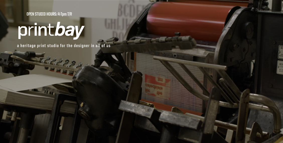
PrintBay Studio is a hands-on letterpress and printmaking space connected to Purdue's PATTeRN research initiative. Students love the studio, with its tactile, experimental nature draws them in. But the website told a different story.
The existing site was outdated, confusing, and inaccessible. Key information was buried in PDFs. Internal jargon alienated newcomers. Students couldn't find basic details like workshop schedules or how to get involved. The digital presence didn't match the studio's dynamic, welcoming reality.
"A key challenge was translating the studio's vibrant, experimental culture into a digital space. The existing language felt outdated and failed to communicate the dynamism students experience in person."
Understanding the Gap
To uncover what wasn't working, I conducted heuristic evaluations of the existing site and user interviews with students during the summer semester, when campus engagement was naturally lower.
What I Found
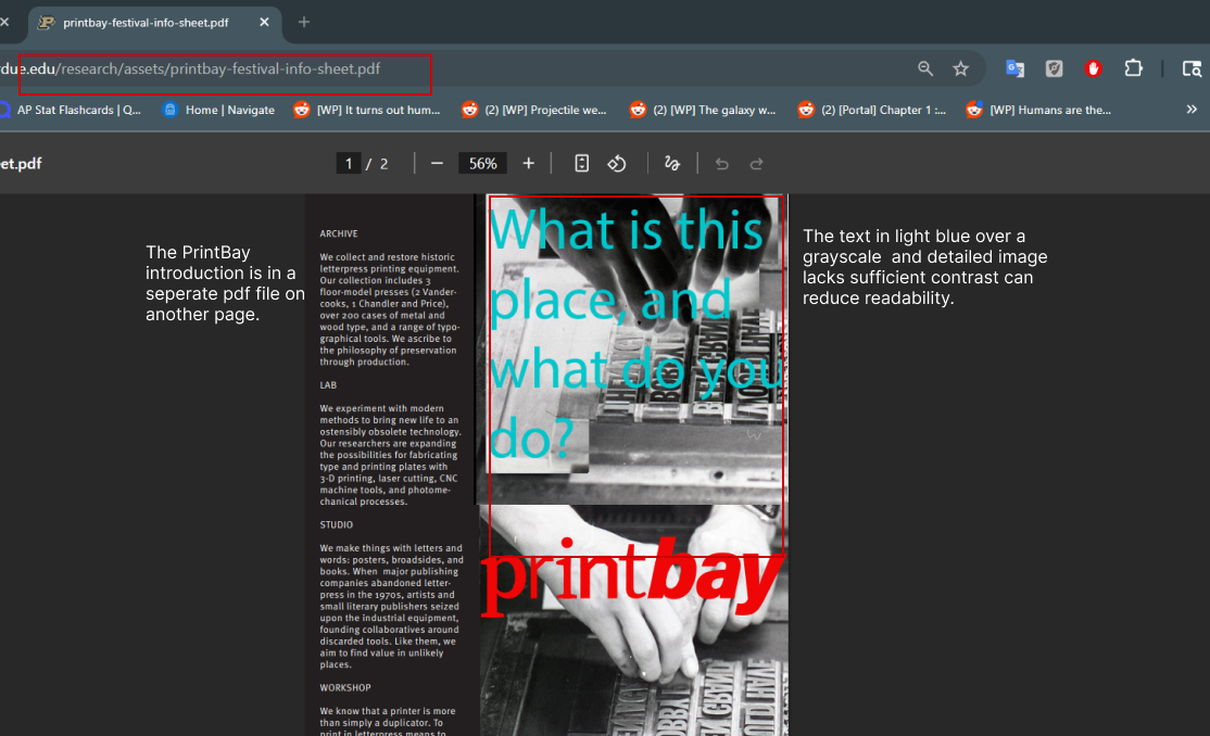
- Introductory content separated in a PDF increased cognitive load but users expected info to be directly on the page
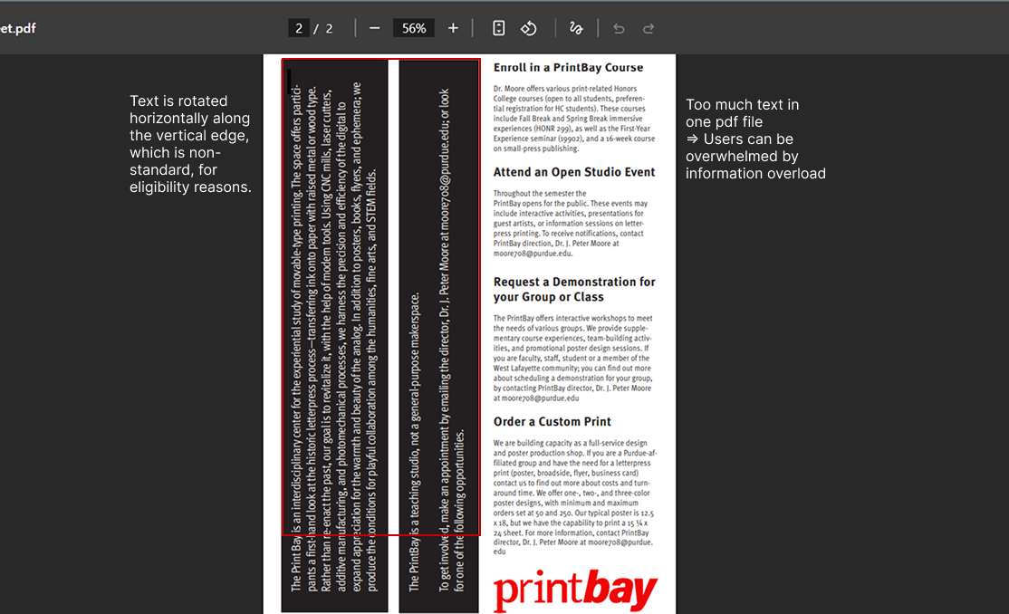
- Low readability due to poor color contrast made text difficult to scan
- Confusing layout with rotated text made content genuinely hard to read
- Overemphasis on decorative design obscured actual meaning and accessibility
- Students were confused about the relationship between PrintBay and PATTeRN
- Participants struggled to find staff contact info, workshop schedules, and enrollment forms
- Users expected hyperlinks, newsletters, and functional forms, all of which were missing
Problems Identified
Screenshots showing usability issues from the original site
The Real Mental Model
Students' mental model starts with PrintBay as the main entry point, not PATTeRN. To improve engagement, the website needed to prioritize accessible content, showcase the studio's energetic presentation, and create clear pathways for student involvement.
Early Wireframes
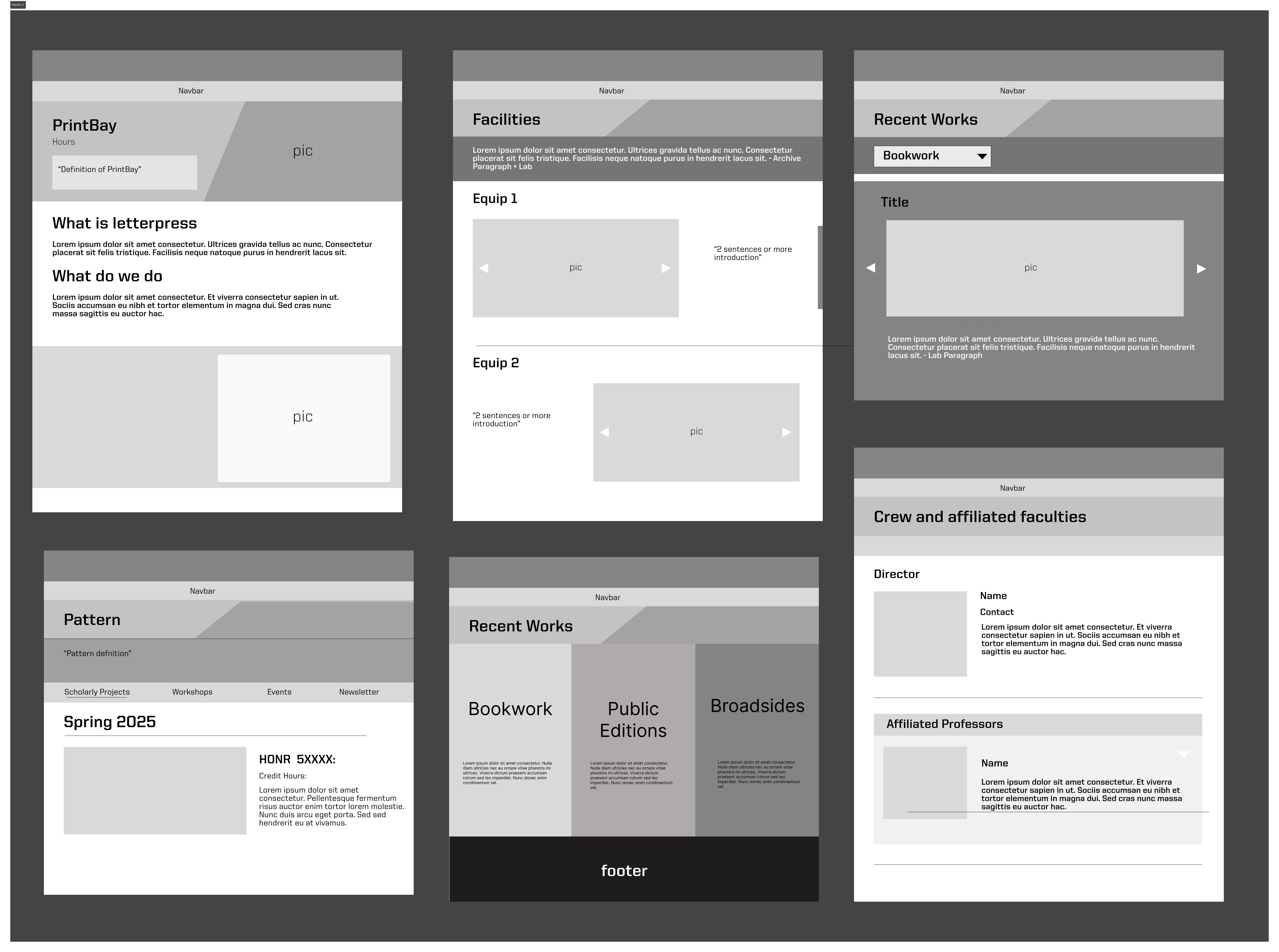
Early wireframes focused on restructuring information architecture, clarifying terminology, and ensuring essential information was immediately visible without reliance on PDFs.
The Mid-Fidelity Pivot
With the wireframes approved, I moved into a mid-fidelity prototype that built directly on the layout my client had signed off on. The structure was clearer, the hierarchy improved, and the navigation made sense. I felt confident presenting it.
The client, however, had a different reaction. Despite having approved the layout direction earlier, he now felt the homepage relied too heavily on materials carried over from the old website. He wanted the studio's digital presence to feel entirely fresh with no reuse of legacy imagery, text blocks, or visual patterns from the original site on the homepage.
"The client's feedback was clear: the homepage needed to stand on its own. Even though the layout had been approved, the content within it still carried the weight of the old site and that wasn't the direction he envisioned for the studio."
Rather than trying to salvage the prototype, I made the decision to start the homepage from scratch. I went back to the reference sites and additional inspirations my client had shared with me, studying how other studios and creative spaces presented themselves online. This time, I focused less on restructuring the existing content and more on letting the studio's identity lead by using new visual storytelling, fresh imagery, and a layout that felt like a departure rather than a revision.
This pivot was ultimately what shaped the final design. The earlier research and wireframing work wasn't wasted though, as it gave me a deep understanding of the information architecture and user needs. But the visual direction needed to be reimagined from the ground up to match the energy my client wanted to project.
Inspiration Review
Reference sites shared by the client that informed the new visual direction
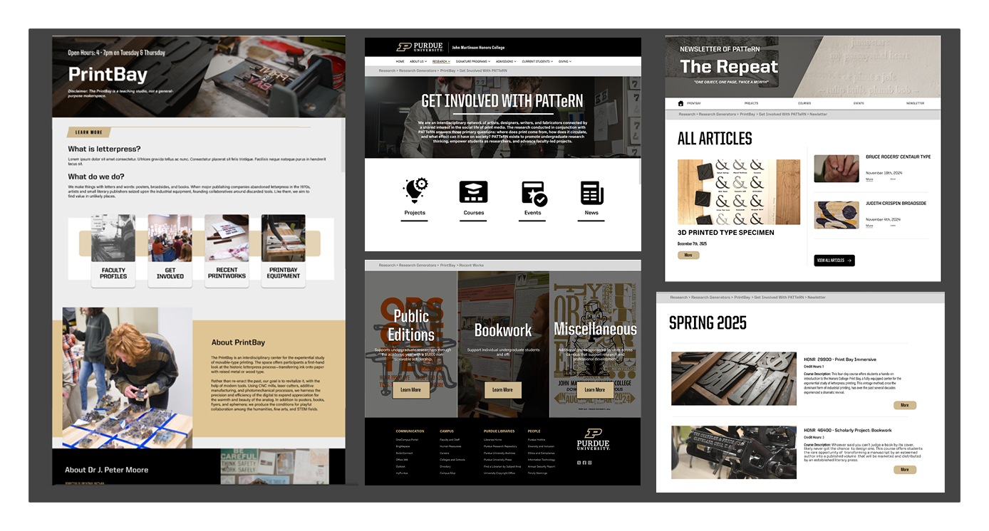
The Result
Reflections
"Visual design is not decoration. It's a core part of communication."
This project taught me that client feedback can signal deeper issues. When the mid-fidelity designs didn't capture the studio's character, it wasn't just about colors or fonts. It meant the layout and hierarchy needed rethinking.
Meaningful iteration often requires revisiting layout and hierarchy, not just surface-level refinements. Designing within institutional constraints also requires strategic trade-offs between branding consistency and user-centered clarity.
Even with limited access to users during the summer semester, qualitative insights from consistent patterns in interviews strongly informed the structure and direction of the redesign.